Swatches
Meet My "Decorator"
 I did 3 thin coats, because I like to not because this polish needed it. This color isn't revolutionary by any means but the formula is wonderful. I love bold orange toned red shades so I'm always happy to add another to my collection.
Got The Mean Reds
 2 rich, creamy perfect coats. When OPI nails it, they really nail it. This polish is a bright, luxurious looking red that is perfect for fall and holiday time. Even though I have a near dupe for this shade, I'm a huge red polish fan so I'm happy to have this one.
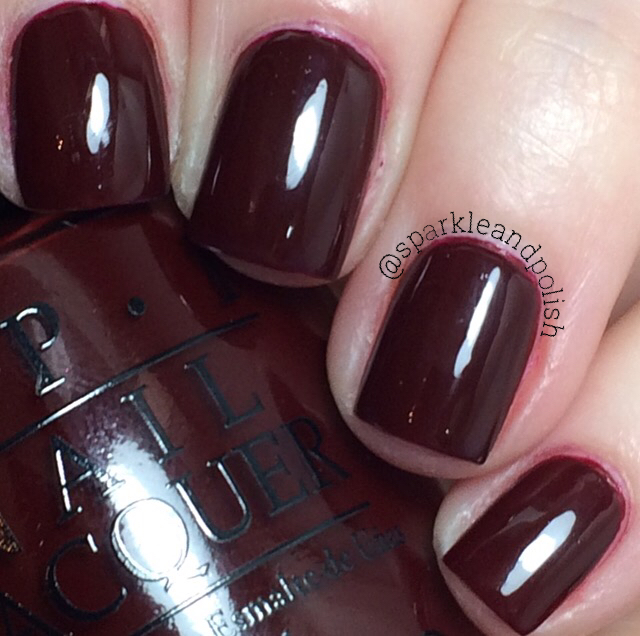
Can't Read Without My Lipstick
 I did 3 thin coats of this rich oxblood polish. The formula is pretty thin, almost in to crelly territory and was slightly patchy. I do absolutely love the color so I think the extra work is worth it.
I Believe In Manicures
 I did 3 thin coats to reach even opacity. I don't understand why this polish wasn't named Breakfast at Tiffany's as it is very close to the classic Tiffany blue. The formula was a little thin, but not difficult to apply.
Sunrise... Bedtime
 This is pale, rosy pink holographic glitter in a clear base. 3 coats for opacity, but next time I wear this I will be using the sponging method to get better coverage. Even with top coat, this polish dries down really bumpy.
Champagne for Breakfast
 This polish is made up of small silver holo glitter particles in a clear but cloudy base. It isn't super densely packed so it can easily be used as a topper polish. It took 4 coats to reach this opacity. Next time I wear this, I will definitely sponge it on because the base is weirdly thick. I think this polish looks really light and etherial, but I have so many better versions of this from Indie brands that I don't see myself using this very often.
 Above is 1 coat layered over Can't Read Without My Lipstick. Even though I topped this swatch with a thick coat of HK Girl, you can see the texture that the weird base has.
Comparisons
Meet My "Decorator"

Got The Mean Reds

Can't Read Without My Lipstick
I Believe In Manicures

Sunrise... Bedtime

Champagne for Breakfast


Comparisons
Meet My "Decorator" vs OPI Tasmanian Devil Made Me Do It vs OPI Red Lights Ahead... Where?
 Decorator on middle and pinky fingers, Devil on pointer finger and Red Lights on ring finger. These are all very similar, but none are exact dupes. Decorator has the least white in it, while Red Lights leans the most pink. Red Lights also has a much thinner formula than the other two.
Got The Mean Reds vs OPI Having A Big Head Day vs OPI Love Is In My Cards
 Mean Reds on pointer and ring fingers, Big Head on middle finger and Love on pinky finger. Love is a much cooler toned red, and is slightly deeper. Mean Reds and Big Head are incredibly similar, if I'm going to be nit-picky I'd say Big Head is just slightly warmer/more orange toned. But seriously there two are so similar, I don't think it is necessary to have both. All 3 of these polishes have amazing formulas, I don't think you can go wrong with any of these shades.
Can't Read Without My Lipstick vs OPI Malaga Wine vs OPI Guys and Galaxies
 Lipstick on my pointer and ring fingers, MW on my middle finger and GG on my pinky. These are definitely not dupes, but I'd call them all shades of the same color. You could get a really smooth gradient from using these 3. I think I like Lipstick and MW best because of the creamier formulas, while I love GG as a color it has a more crelly like formula so I like it less.
I Believe In Manicures vs OPI Sailing and Nailing
 Believe on my middle and pinky fingers, Sailing on my pointer and ring fingers. While I'm glad OPI has released so many blue polishes this year, I wish there was a bit more differentiation between the shades. In the bottle these look almost identical, but on the nail the differences are more apparent. Sailing is lighter and has more white in the base.
I don't have anything close to Sunrise.... Bedtime, but I think it is close to OPI Teenage Dream and Painted Polish Plastered In Pink.
Champagne for Breakfast vs OPI My Voice Is A Little Norse vs Painted Polish Drunk On Holo
 Champagne on my pointer and ring fingers, PP on my middle finger and Norse on my pinky. Obviously Norse and Champagne aren't dupes but they were my closest OPI options. The PP and Champagne are very similar in concept, but the PP glitter is much more holo and sparkly.
Any other comparisons you would like to see, let me know in the comments. Also, let me know which polish from this collection is your favorite :)
Stay Sparkly,
A

Got The Mean Reds vs OPI Having A Big Head Day vs OPI Love Is In My Cards

Can't Read Without My Lipstick vs OPI Malaga Wine vs OPI Guys and Galaxies

I Believe In Manicures vs OPI Sailing and Nailing

I don't have anything close to Sunrise.... Bedtime, but I think it is close to OPI Teenage Dream and Painted Polish Plastered In Pink.
Champagne for Breakfast vs OPI My Voice Is A Little Norse vs Painted Polish Drunk On Holo

Any other comparisons you would like to see, let me know in the comments. Also, let me know which polish from this collection is your favorite :)
Stay Sparkly,
A
Some great swatches here.
ReplyDelete